Website Footer Design Examples: 9 Agency Footers Worth Copying
The footer is the last thing visitors see before they decide to contact you or leave. Here are 9 real agency website footers and what each one does well.
The footer is the last thing visitors see before they decide to contact you or leave. The best agency footers turn that moment into one more chance to start a conversation. These 9 footers from real agency websites on Agency Gallery each do it differently.
1. Upsunday: content before the links
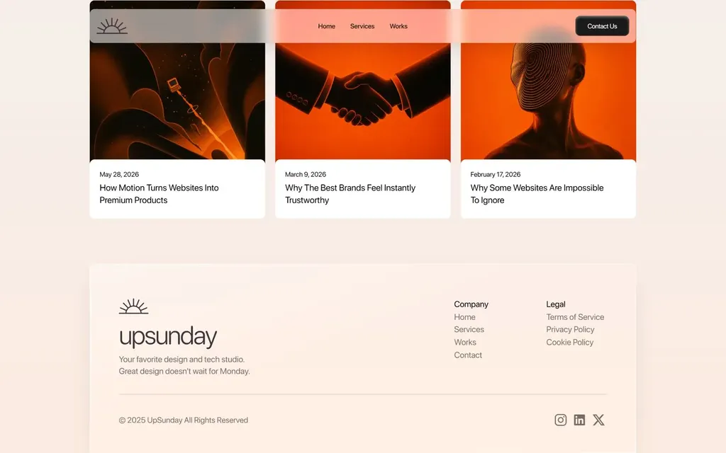
Upsunday puts its latest blog posts as cards right above the footer, so visitors at the end of the page still have somewhere to go.
What to copy: give people one more thing to read before they reach the bottom.
See Upsunday on Agency Gallery
2. BLOON: ask a question, then give two buttons
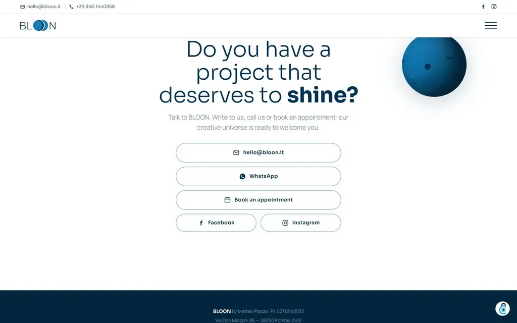
BLOON closes with "Do you have a project that deserves to shine?" and two clear contact buttons underneath.
What to copy: a question that the visitor answers with yes is the easiest call to action to click.
3. The Puzzlers: end on the brand idea
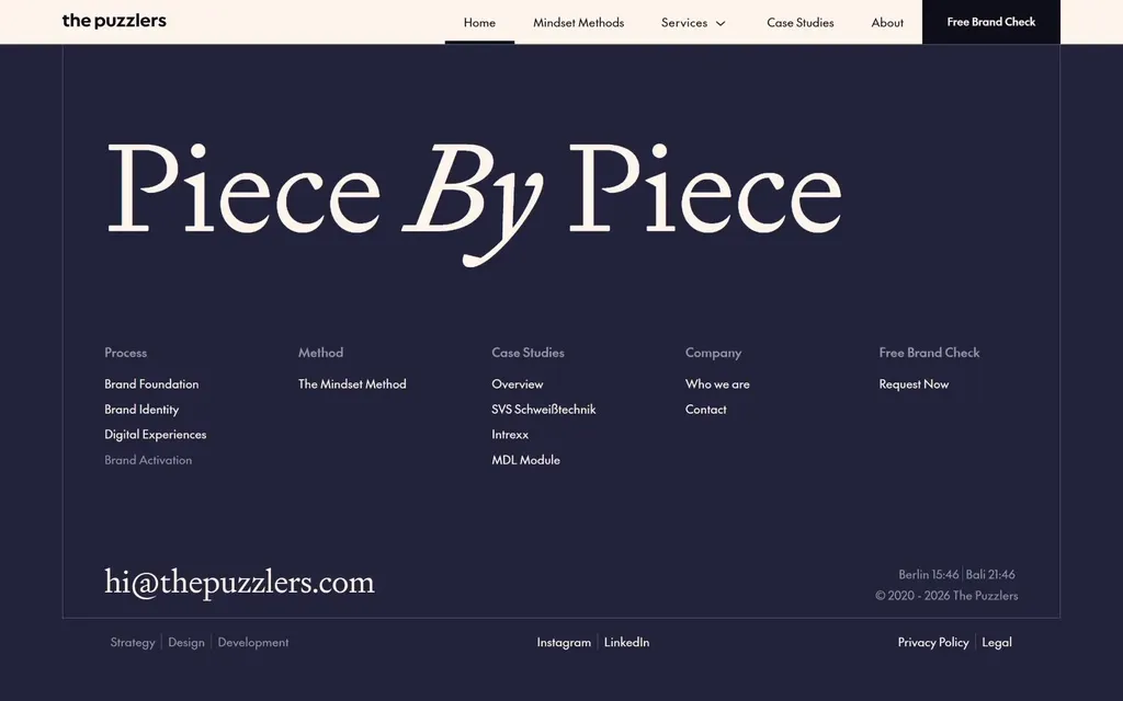
The Puzzlers end on "Piece By Piece", a line that plays on the agency's name, set in serif on a deep navy background.
What to copy: a short line that echoes your name makes the footer part of the brand, not an afterthought.
See The Puzzlers on Agency Gallery
4. K95: the logo, huge
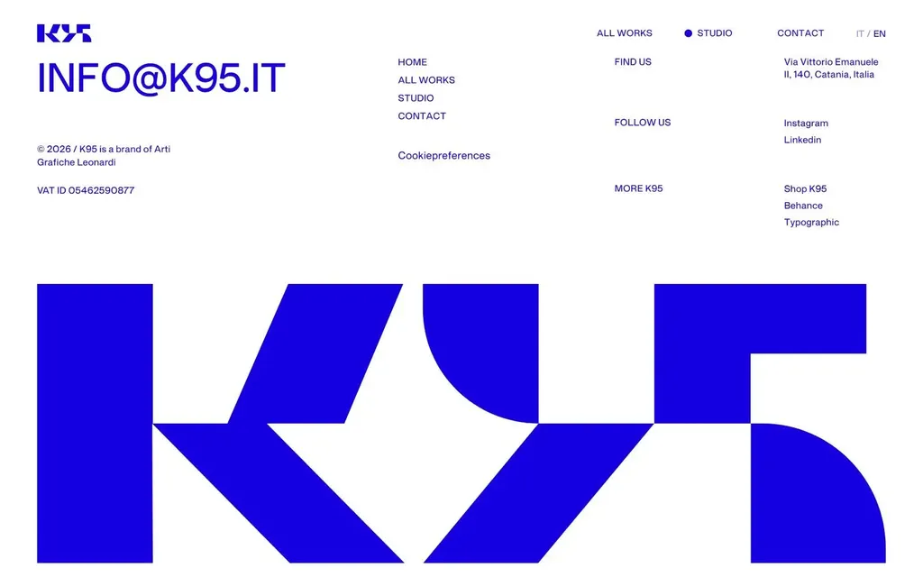
K95 sets its logo across the full width of the footer, with the links small above it.
What to copy: an oversized wordmark is a simple way to make the last screen memorable.
5. Oimachi: a sitemap that is easy to scan
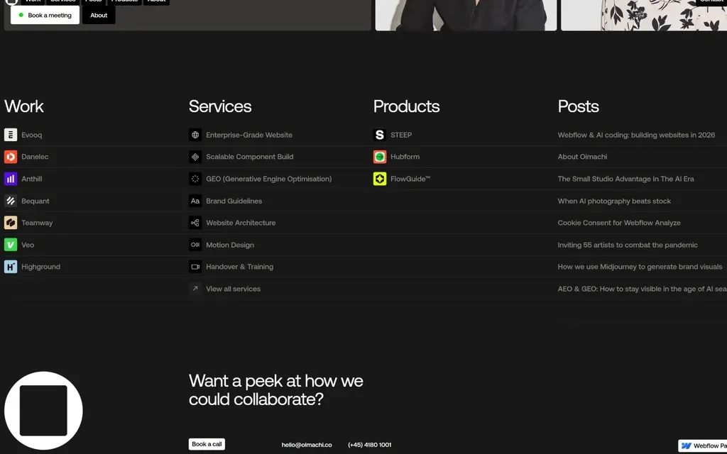
Oimachi organizes every page into clear sitemap columns with short labels.
What to copy: if your site has many pages, a tidy sitemap footer helps visitors and search engines find them.
6. IPER: one color, one action
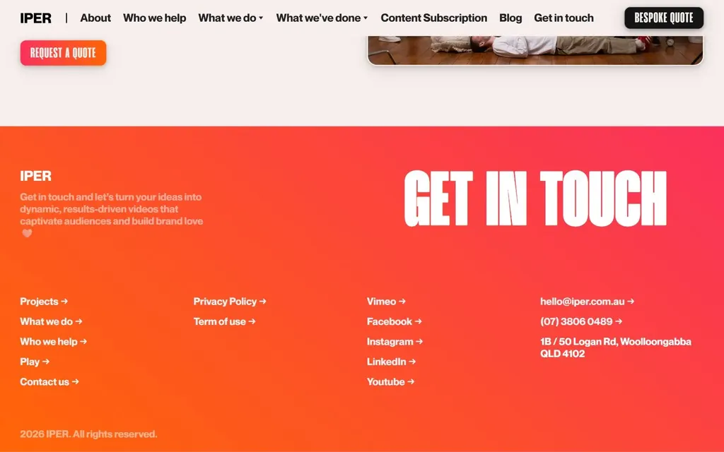
IPER turns the footer into a bright orange "GET IN TOUCH" block that is impossible to miss.
What to copy: a single strong color makes the footer's call to action stand out from the rest of the page.
7. Kingsize Branding Studio: the hero's glow, again
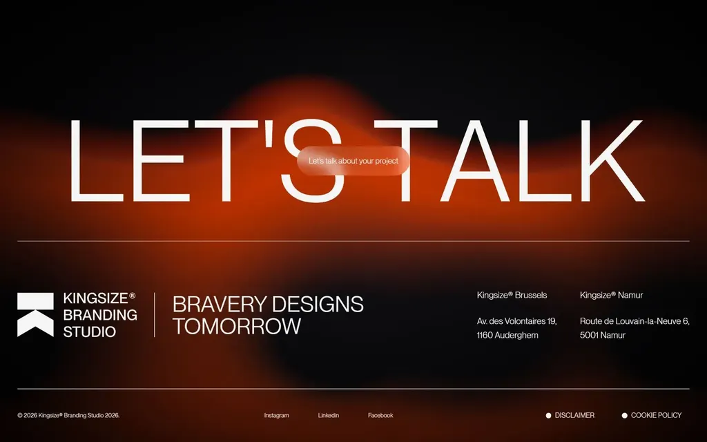
Kingsize brings back the red-orange glow from its hero behind a large "LET'S TALK".
What to copy: repeating the hero's visual in the footer makes the page feel complete.
See Kingsize Branding Studio on Agency Gallery
8. Heco: only three links
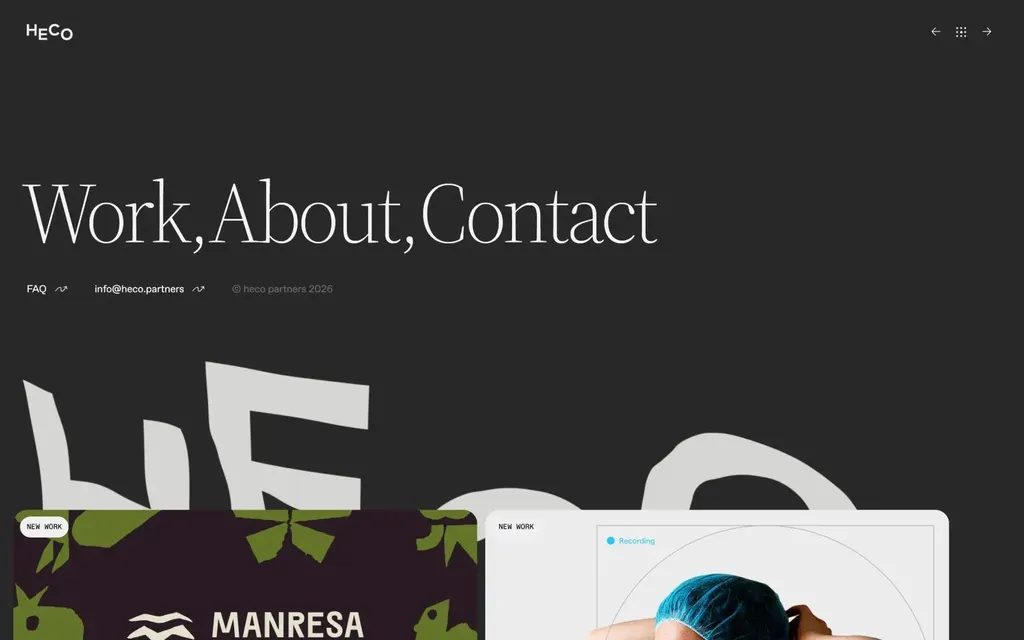
Heco's footer has just three links: Work, About and Contact.
What to copy: small studios don't need a sitemap. Fewer links make each one more likely to be clicked.
9. Hangtime: a box over a photo
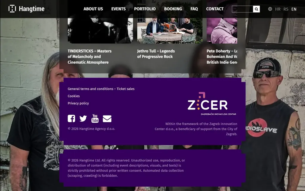
Hangtime places a purple box with its contact details over a full-width photo.
What to copy: a photo behind the footer keeps it visual, and a solid box keeps the text readable.
See Hangtime on Agency Gallery
What the best website footers have in common
- A last call to action. A question, a big "Let's talk" or a contact button.
- The brand, once more. The logo, a color or a visual from the hero.
- Only the links people need. A sitemap for big sites, three links for small ones.
- Somewhere to go next. Blog posts or recent work for people not ready to contact you.
More website footer design examples
These 9 are a small sample. Browse all website footer examples on Agency Gallery, with 250 full-width screenshots from real agency websites, updated every week.