Hero Section Examples: 10 Agency Websites That Get the First Screen Right
A strong hero says what you do in one line, shows something only you could show, and gives one clear next step. Here are 10 real agency hero sections and what each one does well.
A great hero section does three things on the first screen: it says what you do in one line, it shows something only you could show, and it gives visitors one obvious next step. These 10 hero sections from real agency websites on Agency Gallery each do at least one of those exceptionally well.
1. Upsunday: images inside the headline
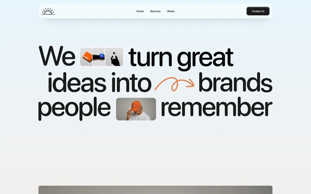
Upsunday sets one oversized line, "We turn great ideas into brands people remember", and drops small photos and icons between the words. The headline is the visual.
What to copy: if you don't have a hero image, put small pieces of your work inside the headline itself.
See Upsunday on Agency Gallery
2. BLOON: the logo is the hero
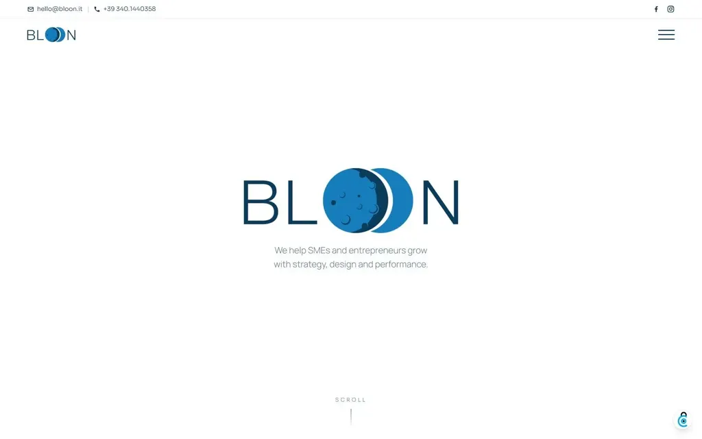
BLOON centers its logo, with the two O's drawn as a blue moon, over plenty of white space and one short line about who they help.
What to copy: when your mark is distinctive, give it the whole first screen and keep the copy to one sentence.
3. The Puzzlers: name the exact audience
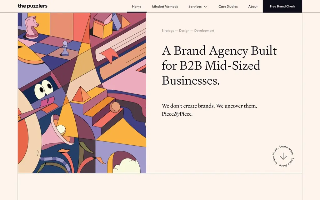
A bright cubist illustration sits next to a calm serif headline: "A Brand Agency Built for B2B Mid-Sized Businesses." Visitors know in one read whether they are the client.
What to copy: say who you are for in the headline, not just what you do.
See The Puzzlers on Agency Gallery
4. K95: show the work immediately
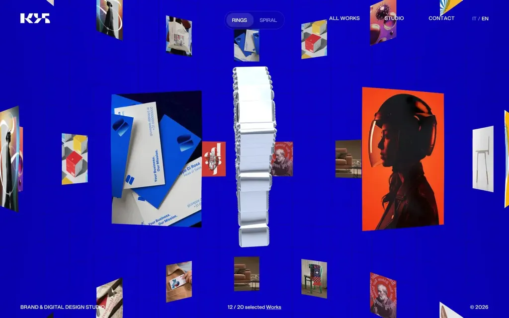
K95 skips the headline and opens on a 3D carousel of its projects floating in an electric-blue space.
What to copy: for a portfolio-led studio, the work can be the first message. Make it move.
5. Oimachi: services in the headline, news on the side
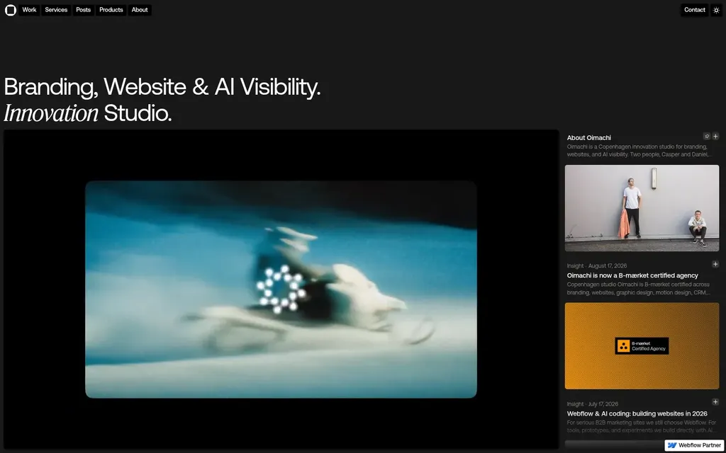
"Branding, Website & AI Visibility. Innovation Studio." lists the services before the video even plays, and a side column shows the studio's latest posts.
What to copy: a short list of services beats a vague slogan, and a live feed shows the studio is active.
6. IPER: navigation at the bottom
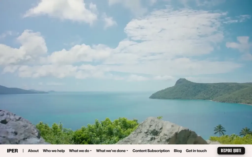
IPER lets a full-bleed landscape fill the screen and moves the navigation, including a "Bespoke quote" button, to the bottom edge.
What to copy: moving the nav down gives the image the whole frame while keeping the call to action in reach.
7. Kingsize Branding Studio: one source of light
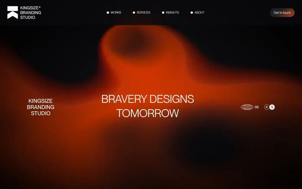
A single blurred red-orange glow on black frames the line "Bravery designs tomorrow."
What to copy: one soft gradient on a dark page is enough mood; keep the type small and centered.
See Kingsize Branding Studio on Agency Gallery
8. Scholz & Friends: the logo shape as a mask
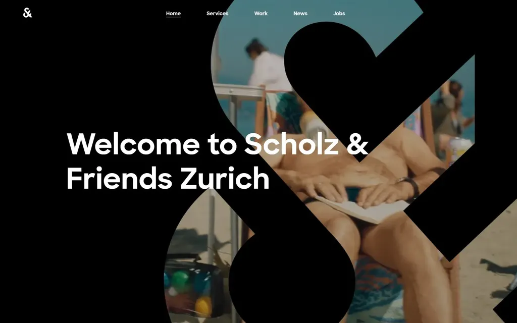
The brand's ampersand becomes a giant cut-out that photography shows through, with a simple welcome line on top.
What to copy: use a shape from your logo as a frame for images, so every photo carries the brand.
See Scholz & Friends on Agency Gallery
9. Heco: type as the image
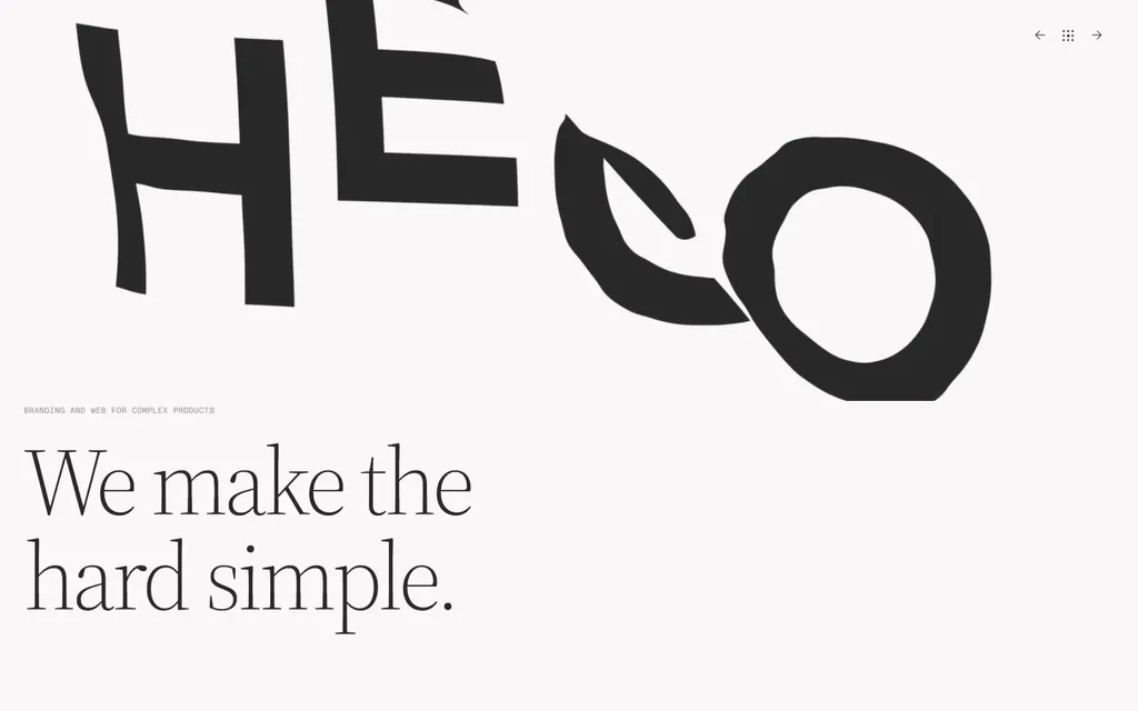
Heco stretches its wordmark across the screen and adds one quiet serif line: "We make the hard simple."
What to copy: a bold wordmark and a short promise can carry a hero with no photos at all.
10. Hangtime: lead with the latest news
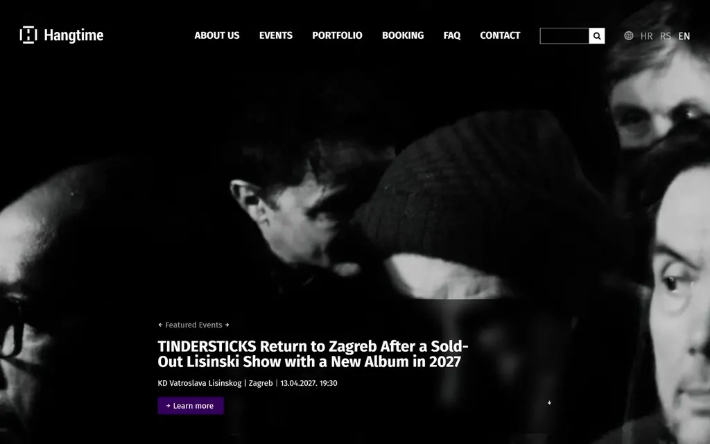
An events agency, Hangtime opens on its newest announcement over a black-and-white photo, with one "Learn more" button.
What to copy: if your news changes weekly, make the hero a featured story instead of a fixed slogan.
See Hangtime on Agency Gallery
What the best hero sections have in common
- One message. Each hero says one thing: a niche, a list of services, or a single promise.
- A visual only they could use. Their own logo, their own work, their own photography, not stock.
- One next step. A single button or none at all, never a row of competing links.
- Room to breathe. Large type and empty space do more than extra copy.
More hero section examples
These 10 are a small sample. Browse all hero section examples on Agency Gallery, with full-width screenshots from more than 250 agency websites, updated every week.