Best Webflow Agency Websites in 2026 (11 Real Examples)
See 11 real agency websites built with Webflow. Get design ideas for layout, color, and motion from top creative agencies.
By Widya Bayu W

Looking for a Webflow agency website that looks sharp and converts well? You are in the right place.
Webflow gives agencies full design control without needing a developer for every change. It handles complex layouts, animation, and CMS content well, and it still ships fast, clean code.
We looked through our full collection of agency websites built with Webflow and picked 11 that stand out. Each one uses Webflow in a different way. Some go bold. Some go quiet and clean. Some lean on real client results.
Here they are, with what makes each one work.
1. Monolith
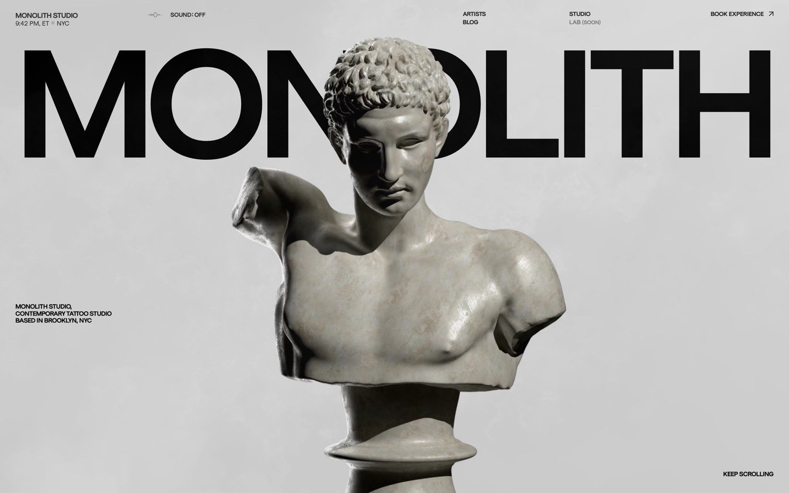
Monolith is a tattoo studio in Brooklyn, and its site leans into a moody, gallery-like feel. A marble classical bust sits under the bold "MONOLITH" wordmark, treating tattoo art like fine art from the first scroll.
What to steal: if your work is visual, let one striking image carry the whole hero — skip the paragraph of copy.
2. Mammoth Murals
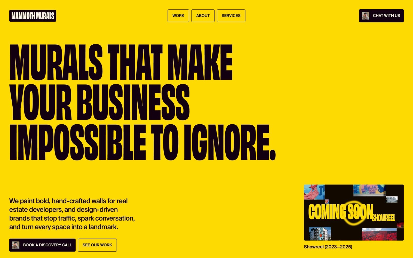
Mammoth Murals paints large-scale murals for brands, and the homepage matches that boldness with a bright yellow background and the blunt line "Murals that make your business impossible to ignore."
What to steal: a loud color and a confident one-liner can do more for a physical-art business than a photo gallery above the fold.
3. By Raven
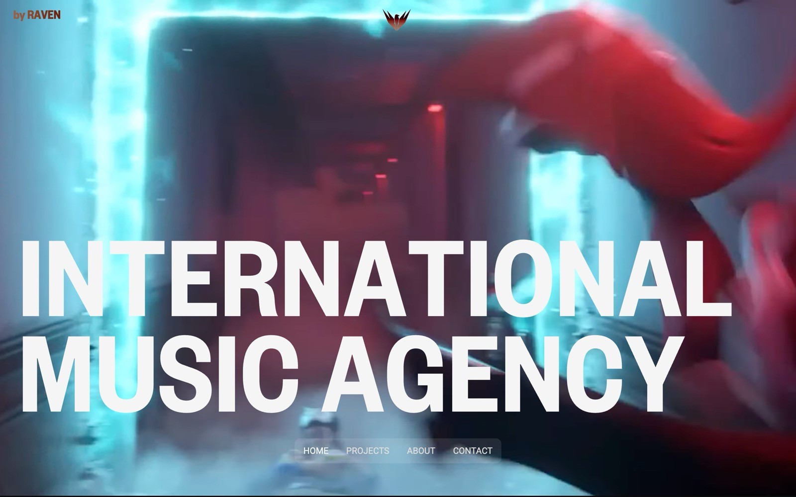
By Raven is an international music agency, and the hero drops you into a blurred, blue-lit tunnel with the line "INTERNATIONAL MUSIC AGENCY" in bold white type — cinematic before you even hit play on anything.
What to steal: use motion-blurred or atmospheric photography to make a service business feel like a film credit sequence.
4. Avant Garde Artist

Avant Garde Artist books electronic music talent, and the site opens with a black-and-white collage of edgy portraits paired with elegant cursive type reading "extraordinary."
What to steal: mixing a gritty photo collage with a refined script font signals "underground but professional" in one glance.
See Avant Garde Artist's full site
5. Off Beat
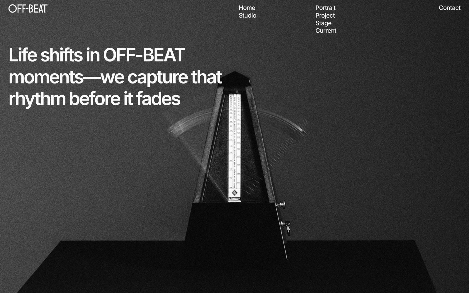
Off Beat is a photography and event studio, and the homepage uses a simple black-and-white metronome graphic with the line "Life shifts in OFF-BEAT moments — we capture that rhythm before it fades."
What to steal: a single symbolic object, shot in black and white, can say more about your craft than a slideshow of past shoots.
6. OH Architecture
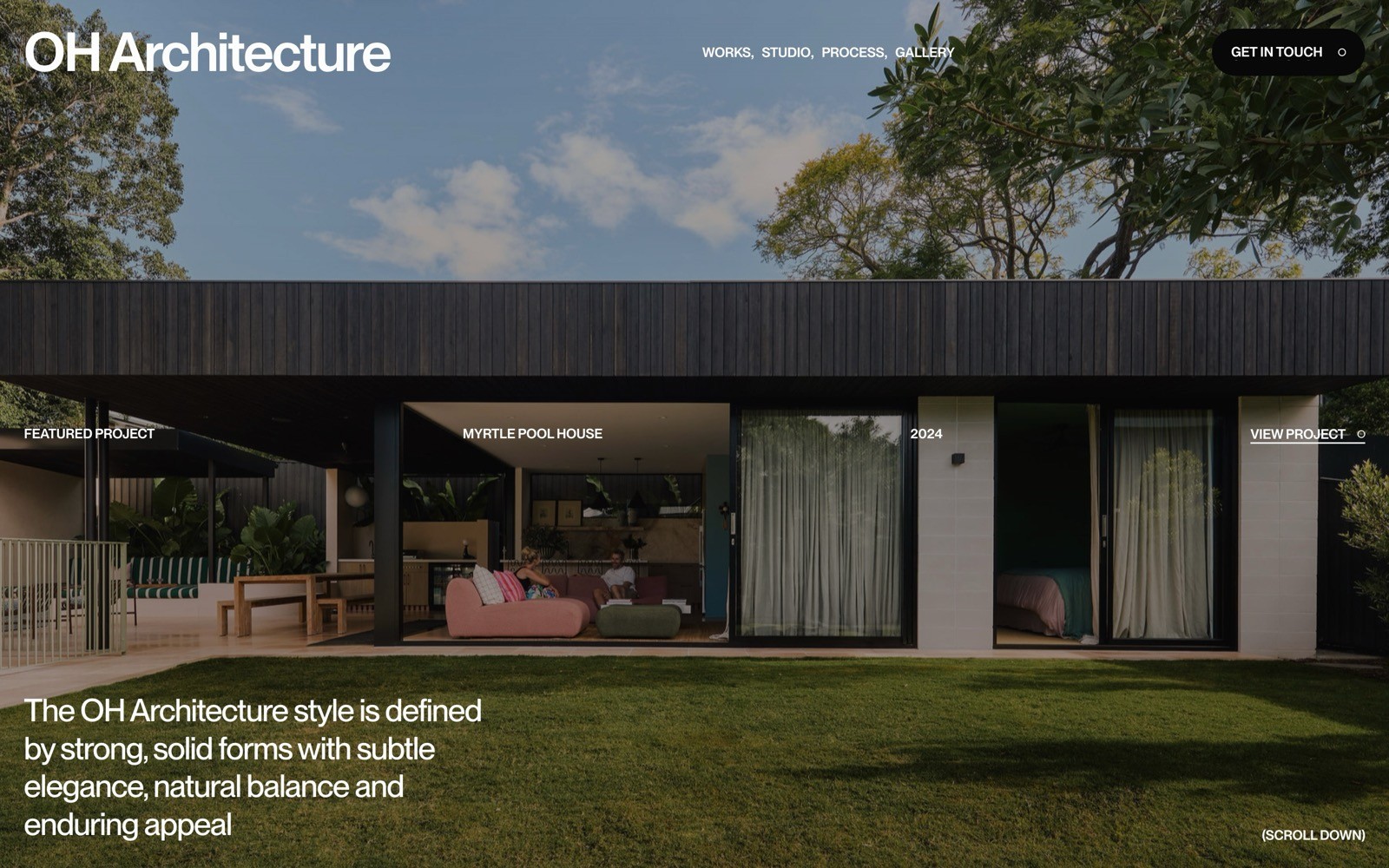
OH Architecture designs homes and commercial spaces in Australia, and the hero uses a clean shot of a modern house facade with big windows and a green lawn.
What to steal: a real, well-shot photo of a finished building says more about your design taste than any rendering could for an architecture practice.
See OH Architecture's full site
7. Creative Giants
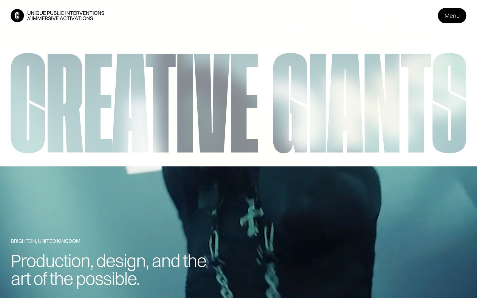
Creative Giants produces large-scale public art and brand activations, and the homepage opens with a bold gradient "CREATIVE GIANTS" wordmark over a figure mid-motion.
What to steal: a gradient treatment on your own name, paired with movement, can make an events or production studio feel as dynamic as its work.
See Creative Giants's full site
8. Nooon Studio
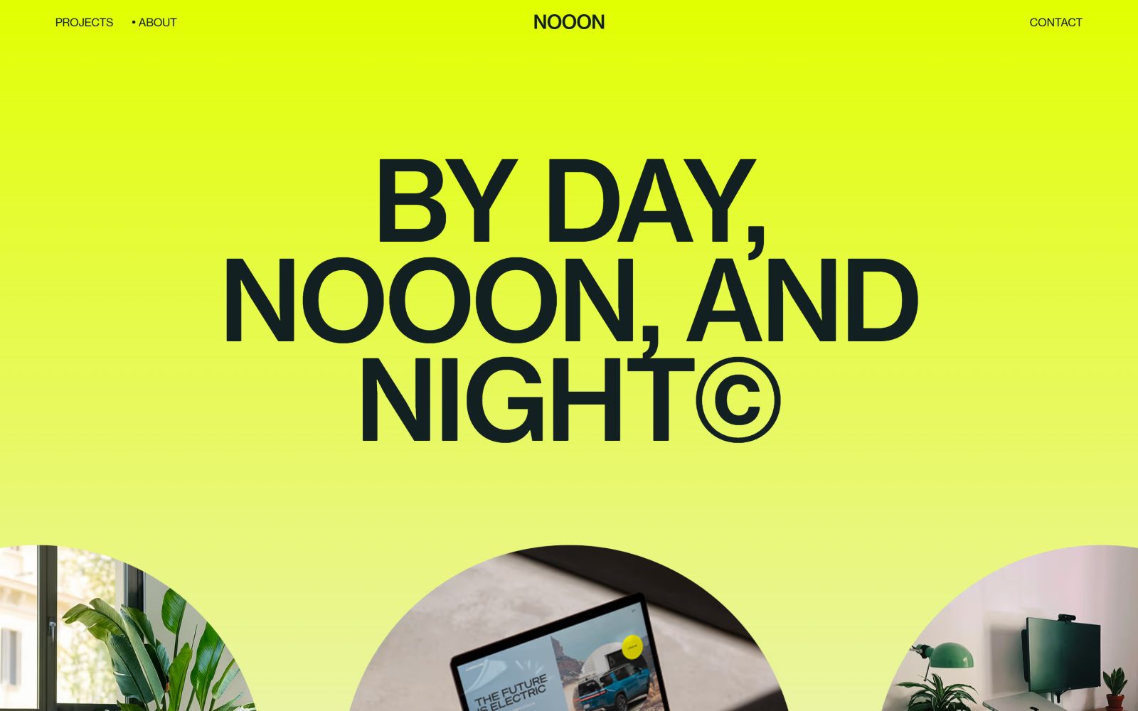
Nooon Studio is a web and branding studio, and the homepage commits to a bright yellow gradient with the playful wordmark "BY DAY, NOOON, AND NIGHT©."
What to steal: a single loud color paired with clever wordplay in your own name can make a small studio instantly memorable.
Vibe: playful, colorful, minimal
9. Studio X
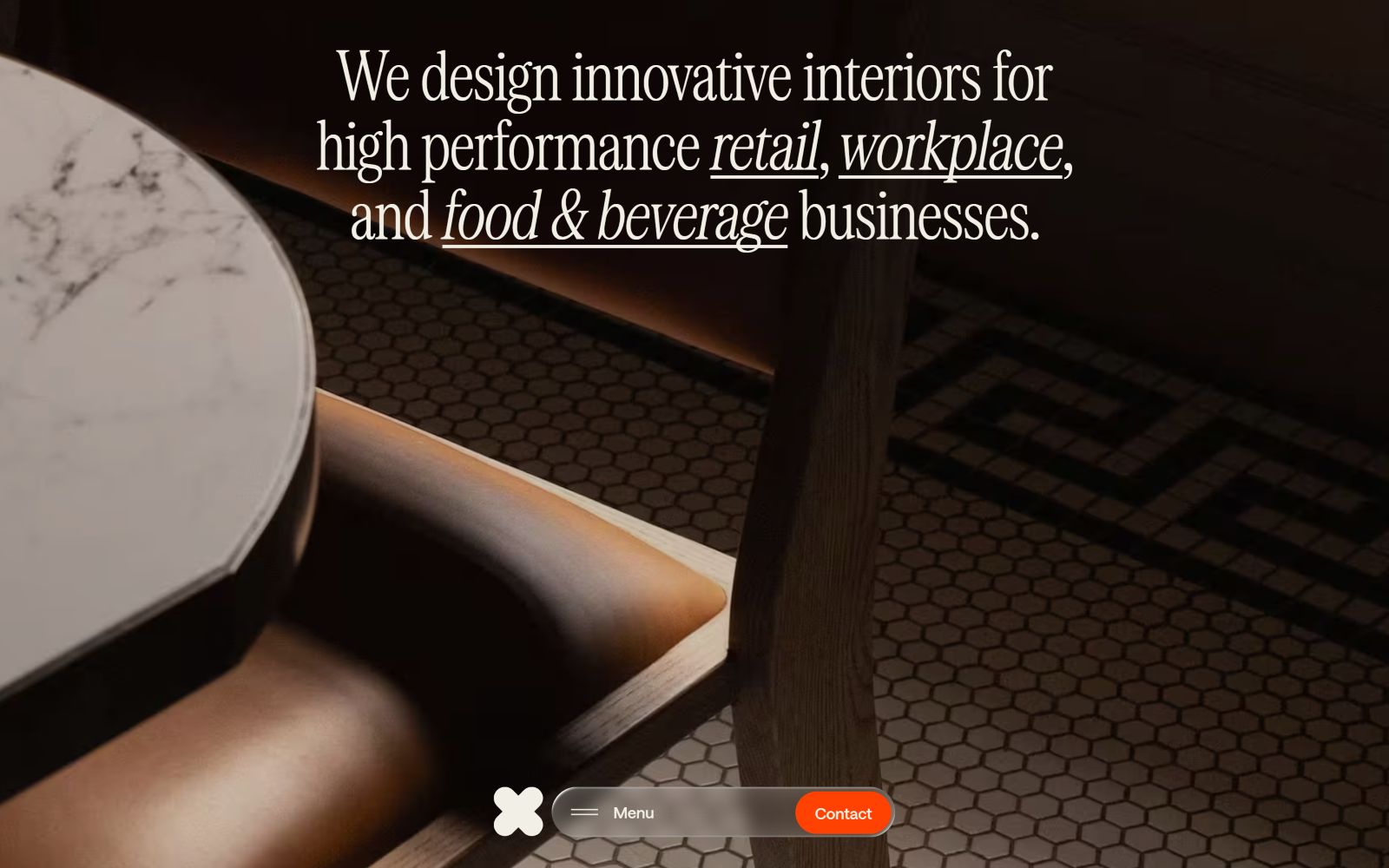
Studio X designs commercial interiors across Asia-Pacific, and the site opens with a warm, hexagonal-tiled interior shot that feels like a finished project rather than a stock render.
What to steal: showing a real, finished space builds more trust than a moodboard for an interiors or architecture business.
Vibe: colorful, playful, minimal
10. Get Hyped
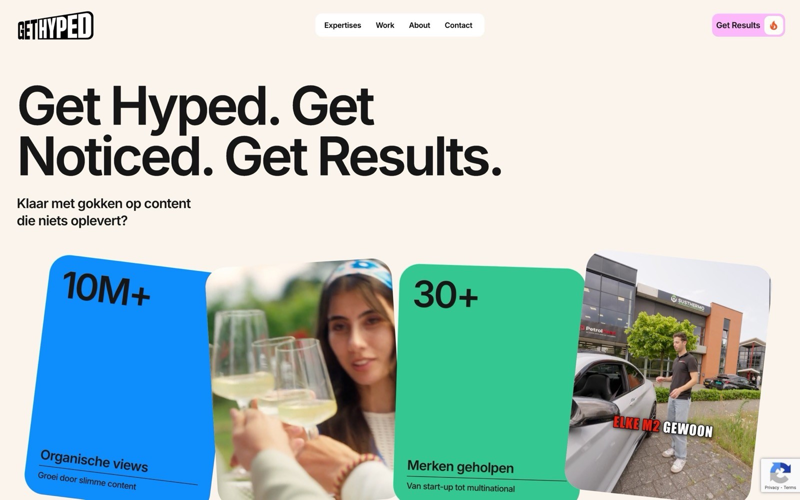
Get Hyped is a short-form content agency, and the homepage uses a soft pastel palette with the punchy line "Get Hyped. Get Noticed. Get Results," alongside cards showing real social stats.
What to steal: surfacing real numbers (followers, views, engagement) right in the hero builds credibility fast for a content or social agency.
Vibe: playful, colorful, light
11. Dedicado
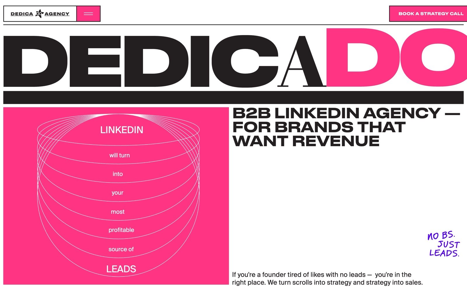
Dedicado turns LinkedIn into a lead channel for B2B founders, and the site leans into a raw, brutalist look — bold black-and-pink type paired with a blunt outreach diagram.
What to steal: a rough, brutalist layout can signal "no fluff" better than a polished corporate template, especially for a lead-gen or growth agency.
Vibe: light, brutalism, colorful
What these Webflow agency websites have in common
A few things show up again and again across this list:
One strong image, one strong line. Almost every hero section pairs a single photo or illustration with one short, punchy sentence.
Copy that says who they are, fast. None of these sites make you scroll to find out what the agency does.
A style that matches the work. A music agency feels cinematic. A mural studio feels loud. The design backs up the pitch.
Want more design inspiration?
Browse more Webflow agency websites, or check out sites by style, like dark, minimal, bold, colorful, and gradients. You can also browse by industry, including branding, web design, and marketing agencies.
Building your own agency site on Webflow? Submit your agency to get featured in our gallery.