Best Framer Agency Websites in 2026 (11 Real Examples)
See 11 real agency websites built with Framer. Get design ideas for layout, color, and motion from top creative agencies.
By Widya Bayu W

Looking for a Framer agency website that looks great and works well? You are in the right place.
Framer is a top pick for agencies right now. It is fast to build with. It looks clean out of the box. And it lets designers add motion and 3D without writing a lot of code.
We looked through our full collection of agency websites built with Framer and picked 11 that stand out. Each one uses Framer in a different way. Some go bold. Some go quiet and clean. Some use motion to tell a story.
Here they are, with what makes each one work.
1. Mirabel

Mirabel is a branding studio, and its site feels like a brand book come to life. The hero section sets the tone right away with strong type and a confident layout. It sits nicely alongside other futuristic agency websites in our gallery.
What to steal: a hero section that shows your brand style before you say a single word about your services.
Vibe: futuristic, dark, minimal
2. Raben Rifaie

Raben Rifaie is a motion and 3D design studio, and the site proves it. The hero uses a grassy landscape with two glowing spheres, paired with the line "A creative design studio for building immersive web and 3D motion."
What to steal: if 3D and motion are your main skill, do not just say it. Show it on page one.
Vibe: animated, playful, minimal
3. Poch Studio
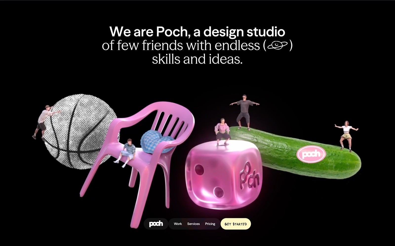
Poch Studio keeps things simple. Black background, white text, and a short, honest line: "We are Poch, a design studio of few friends with endless skills and ideas."
What to steal: you do not need a big team or a big claim. A small, honest studio pitch can build trust fast.
4. Solenne

Solenne works in architecture, and the site matches the industry with a warm, homey shot of a room with a turntable and wooden furniture. The copy is direct: "Smart real estate for buyers, sellers, and investors." See more architecture agency websites for extra ideas.
What to steal: match your imagery to your industry. A lifestyle photo can say more than a stock office shot.
5. Good Habit
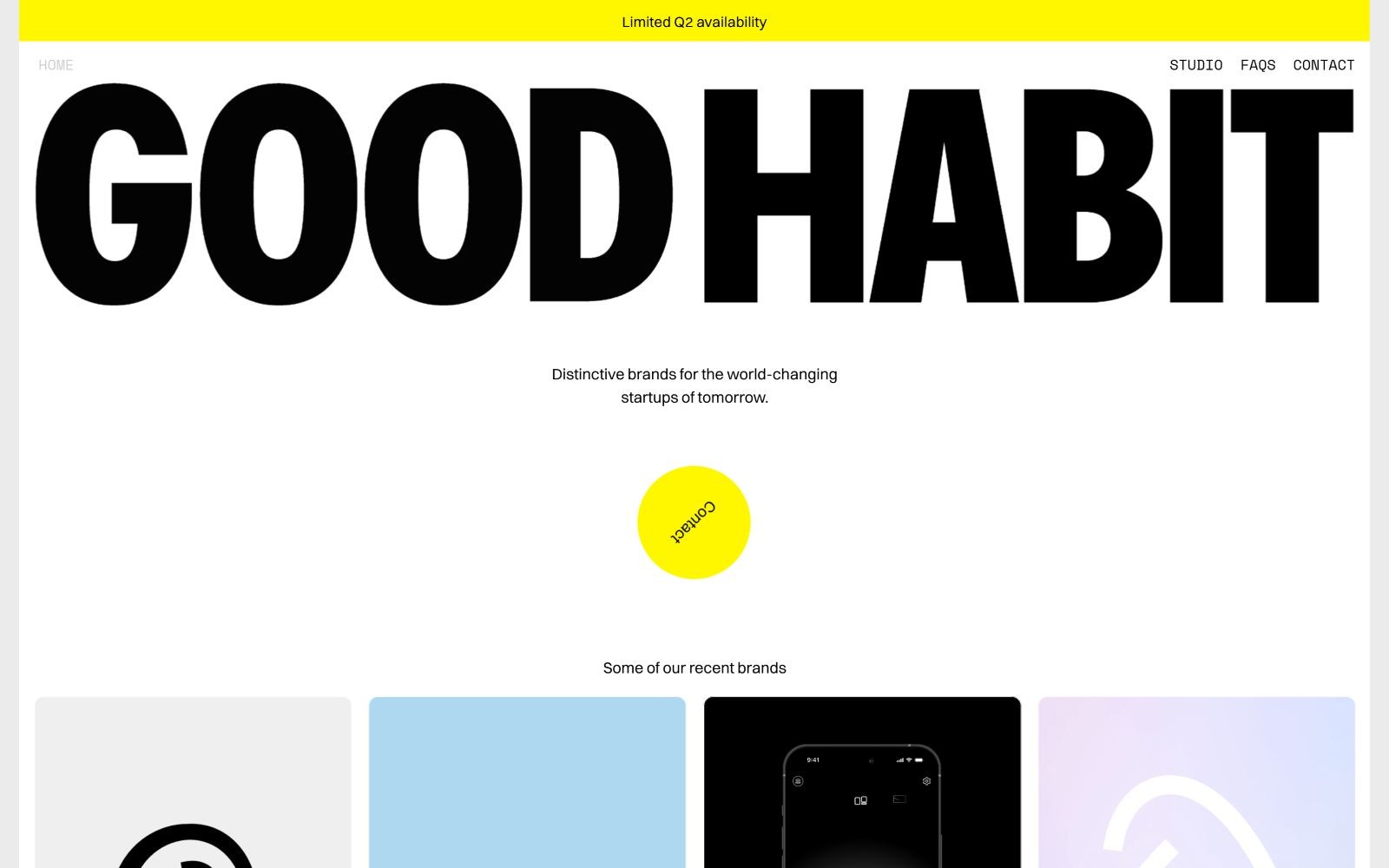
Good Habit is a branding studio with a clean, high-contrast look. Bold black "GOOD HABIT" text sits on a white background, next to a yellow banner that reads "Limited Q2 availability."
What to steal: a small urgency banner, like limited availability, can nudge visitors to reach out sooner.
Vibe: minimal
6. A Love Story
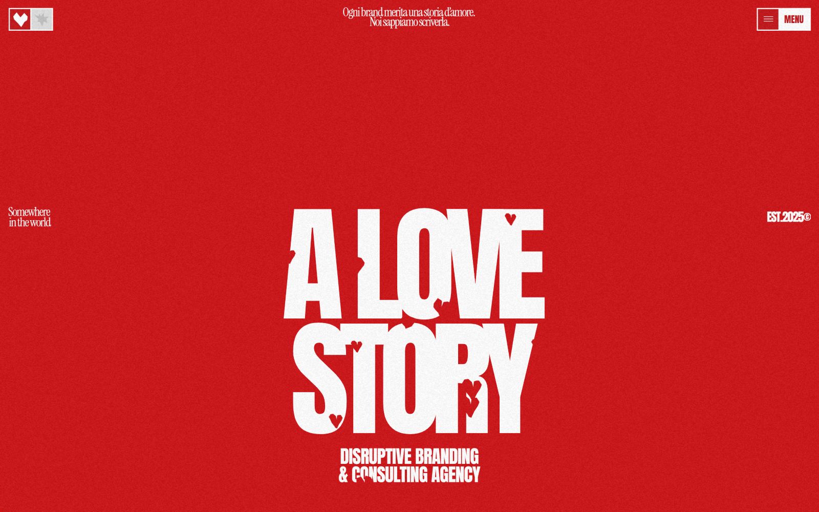
A Love Story is a branding and consulting agency that is not afraid of color. The homepage uses a bright red background with bold white text: "A LOVE STORY" and "DISRUPTIVE BRANDING & CONSULTING AGENCY." It fits right in with other dark themed agency websites worth studying.
What to steal: if your agency has a bold personality, let your color choice say it before your copy does.
Vibe: playful, artistic, minimal
7. Smiling Wolf
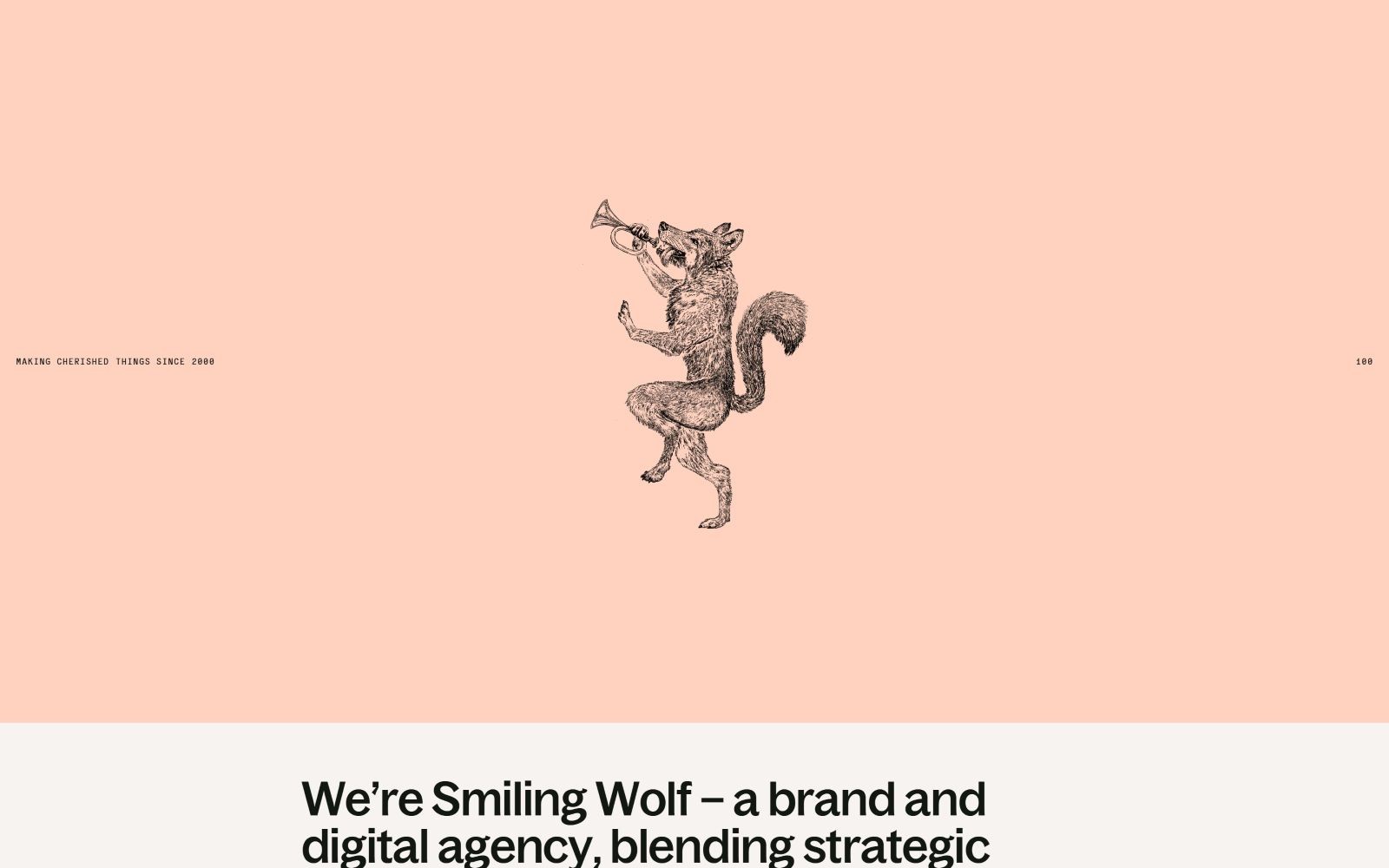
Smiling Wolf is a web design and branding studio, and the site has real personality. A wolf playing a trumpet stands on a peach background, next to the line "Music crushed things since 2000."
What to steal: playful illustration and a bit of humor can help a creative studio stand out in a sea of serious agency sites.
Vibe: playful, minimal, colorful
8. Duties
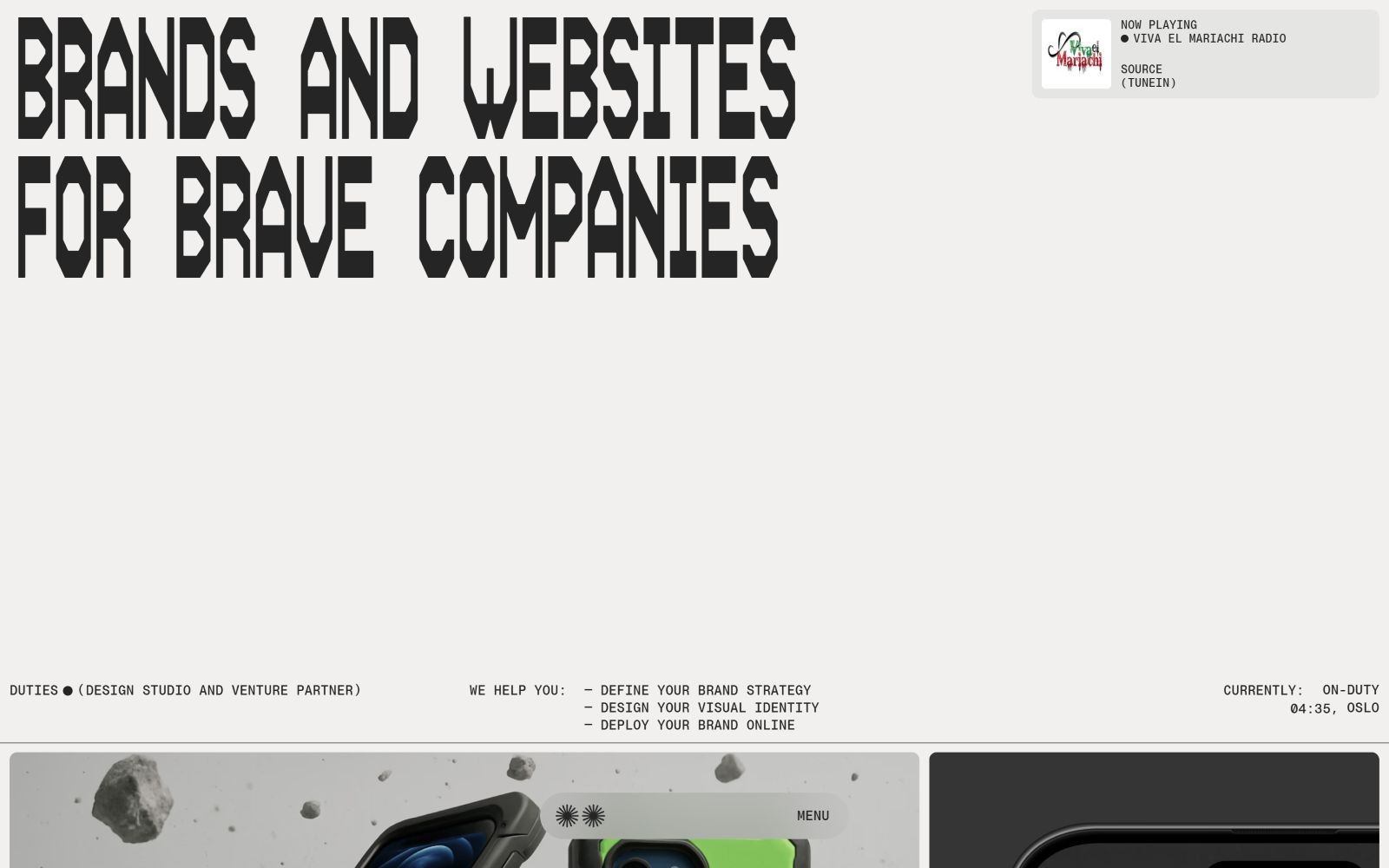
Duties is a branding agency with a minimal, grayscale look. The homepage reads "BRANDS AND WEBSITES FOR BRAVE COMPANIES," paired with small gadget images and soft gray accents. It is a good match for anyone browsing minimal agency websites.
What to steal: you can be bold with your words and still be quiet with your visuals. The mix works.
9. GAA Design Studio
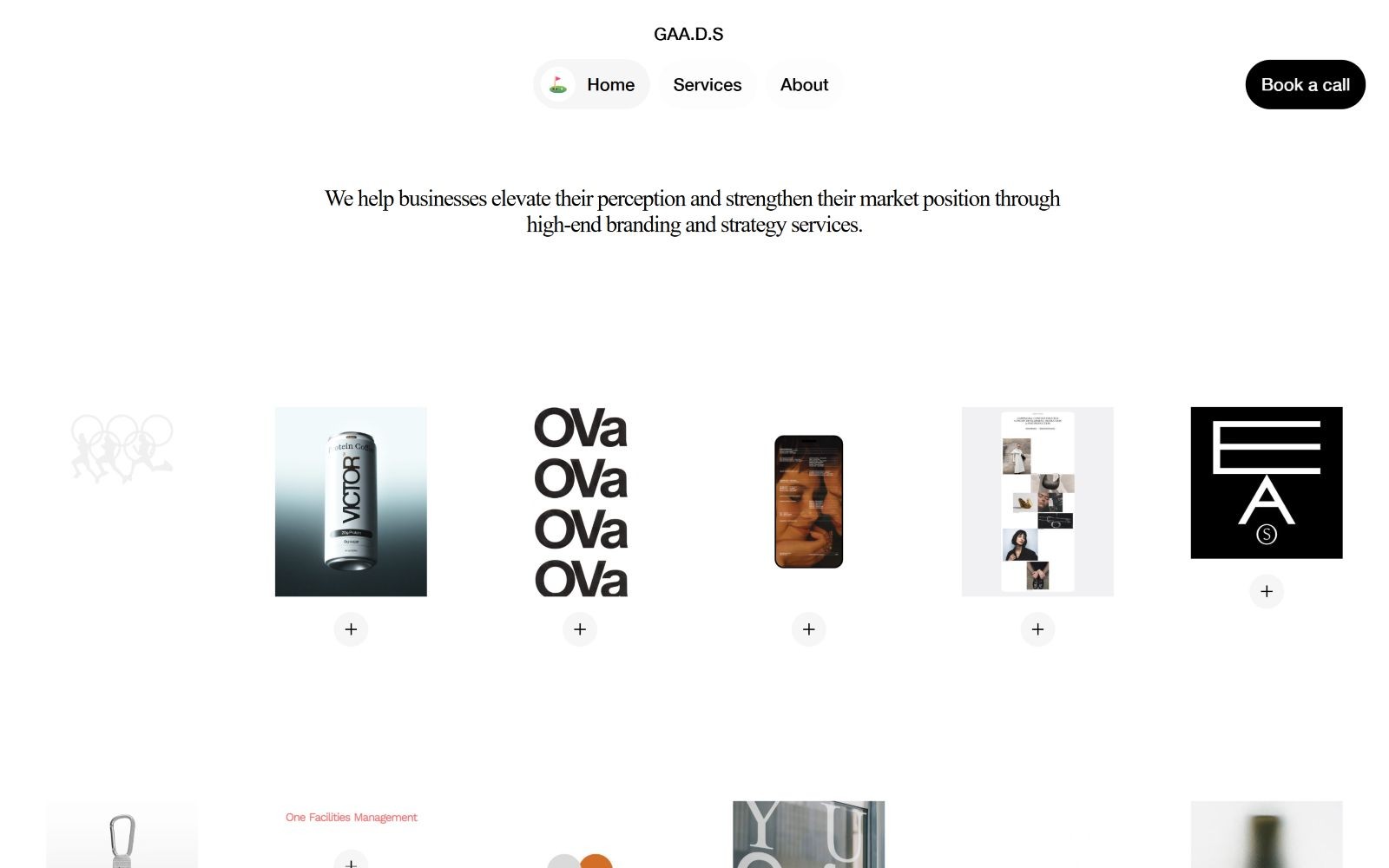
GAA Design Studio is a branding agency with a clean, minimalist layout. Bold black text on a white background reads "We help businesses elevate."
What to steal: a clean layout builds trust because it shows you can design simply and clearly.
See GAA Design Studio's full site
10. Journey Digital
![Starry night sky over a calm ocean; text: "Brave Navigators for Bold Journeys." with icons for Auckland and London. Option: "[LET’S CHAT]".](https://framerusercontent.com/images/bMmgYHiuO0adyAFi4tA2g9gLdM.jpg)
Journey Digital is an AI focused web design agency with a calm, wide open feel. A starry night sky over a calm ocean sits behind the line "Brave Navigators for Bold Journeys," with small location icons for Auckland and London.
What to steal: a big, calm image can make an AI agency feel human instead of robotic.
See Journey Digital's full site
11. Wild Week
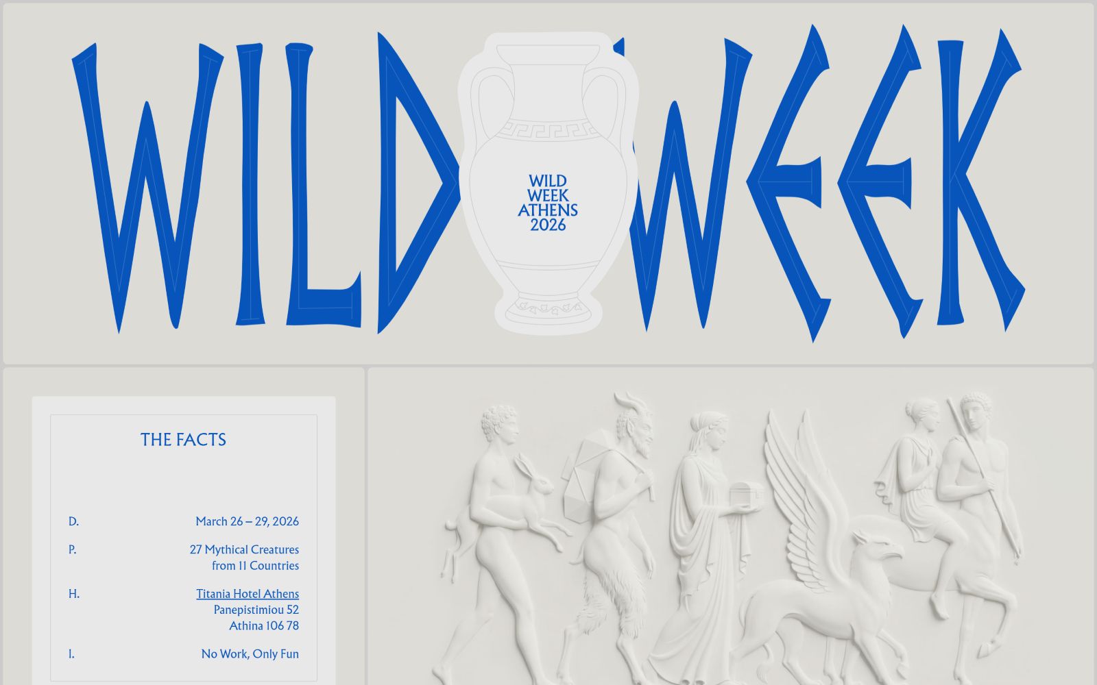
Wild Week is built for a travel event, and it shows. The site uses a light, playful, and artistic style that feels fun instead of corporate. For more ideas in this space, browse playful agency websites or check out other travel industry websites.
What to steal: your site style should match the mood of what you are promoting. A travel event calls for a lighter touch than a law firm would.
Vibe: playful, light, minimal, artistic
What these Framer agency websites have in common
A few things show up again and again across this list:
One strong image, one strong line. Almost every hero section pairs a single photo or illustration with one short, punchy sentence.
Copy that says who they are, fast. None of these sites make you scroll to find out what the agency does.
A style that matches the work. A motion studio shows motion. A travel brand feels playful. The design backs up the pitch.
Want more design inspiration?
Browse more Framer agency websites, or check out sites by style, like bold, minimal, dark, playful, and futuristic. You can also browse by industry, including branding, web design, architecture, ecommerce, and travel agencies.
Building your own agency site on Framer? Submit your agency to get featured in our gallery.